CLAUDIA LI
(FASHION )
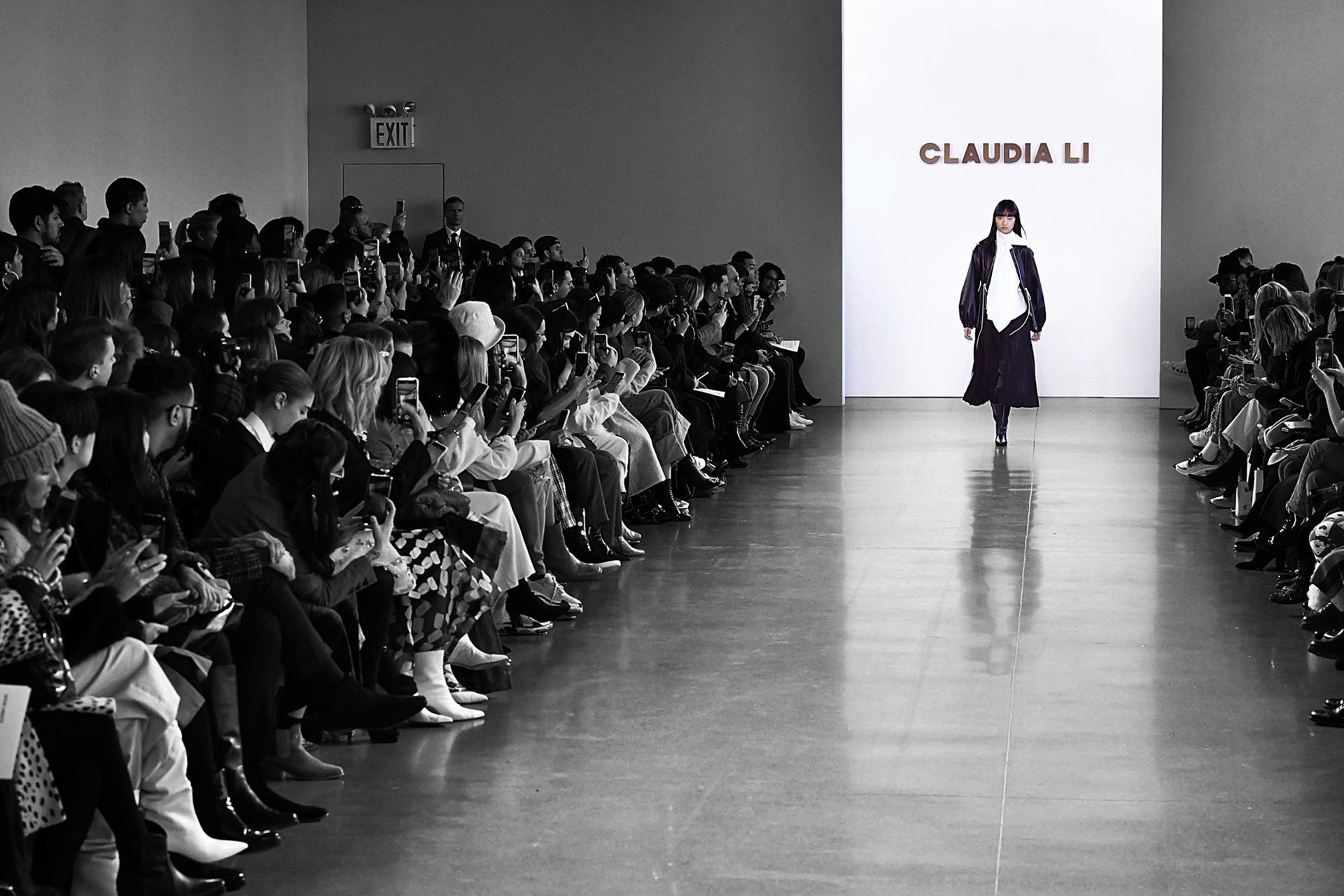
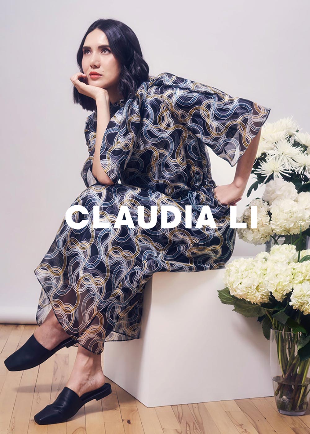
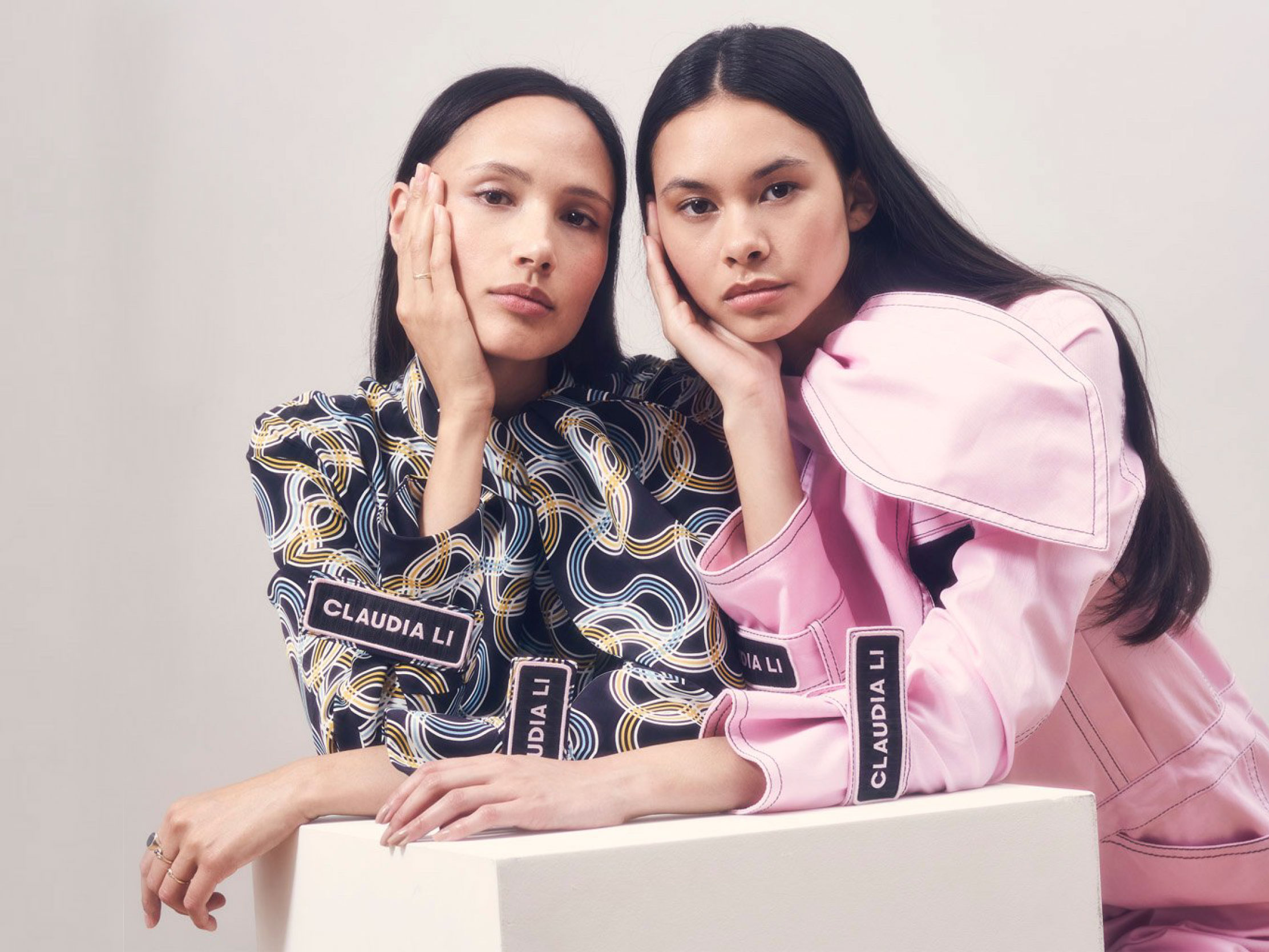
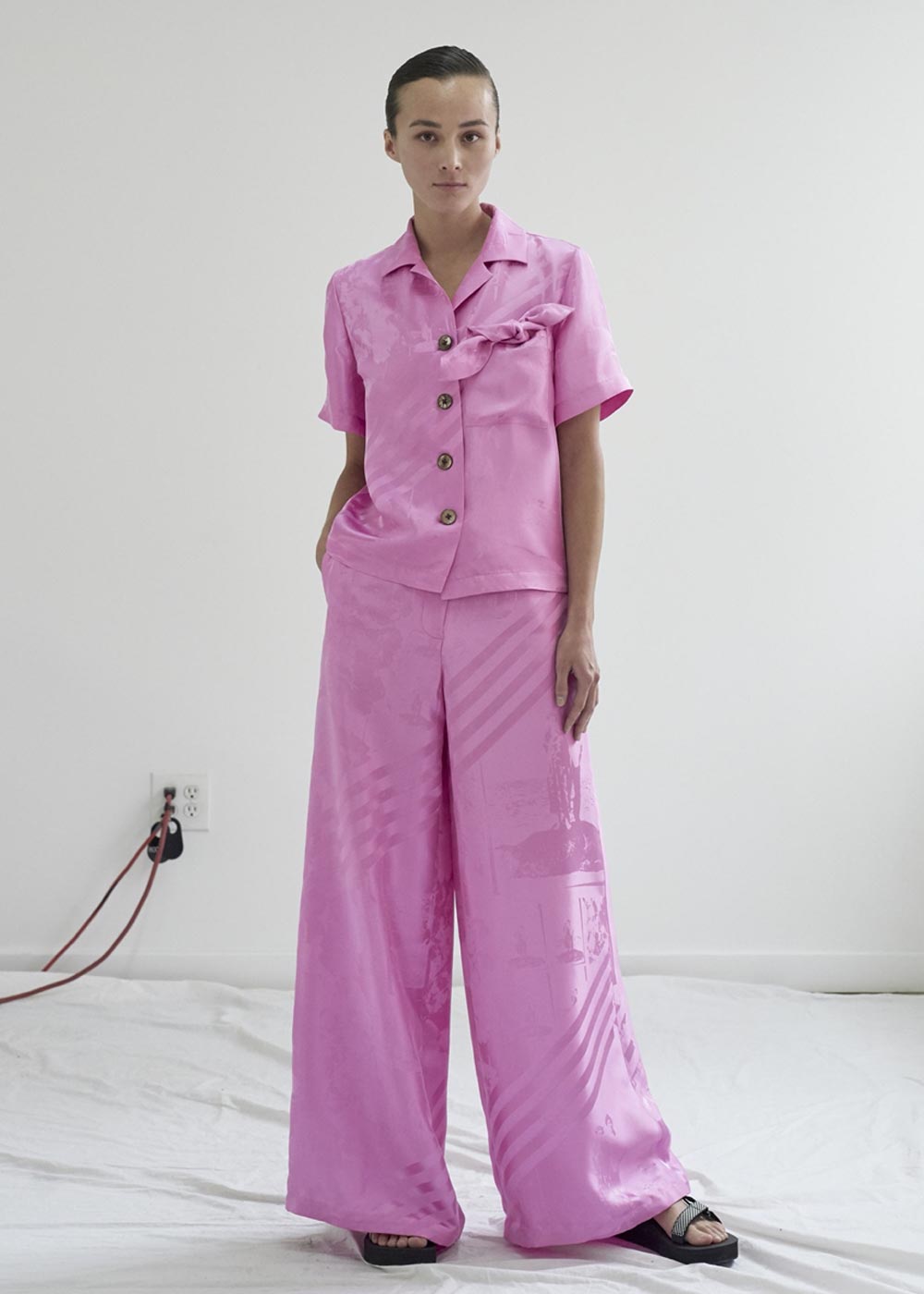
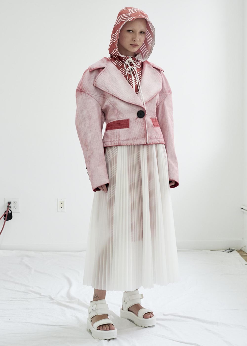
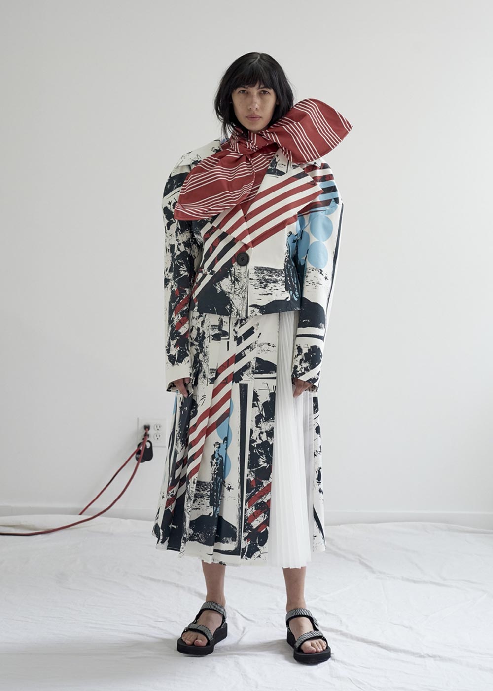
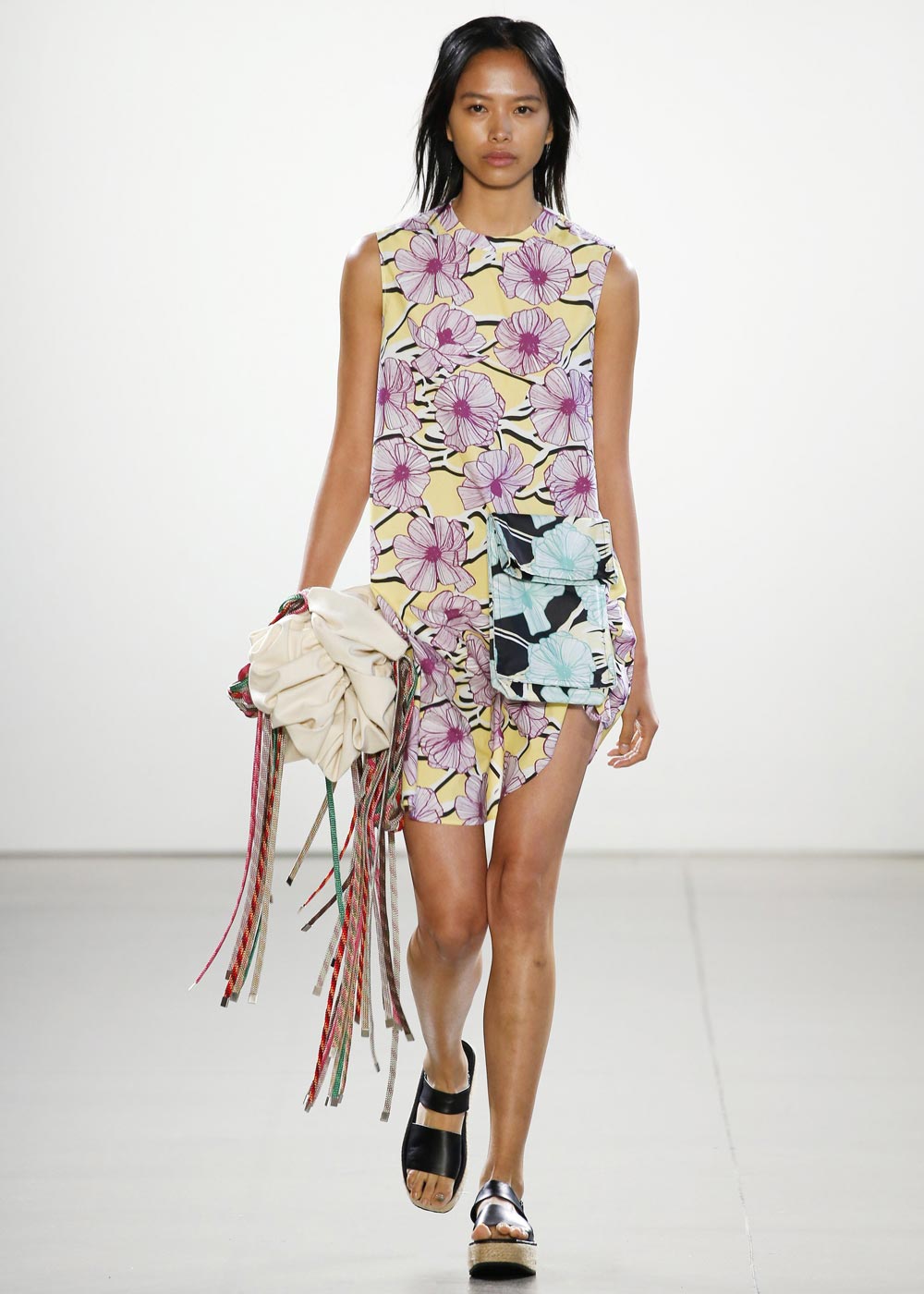
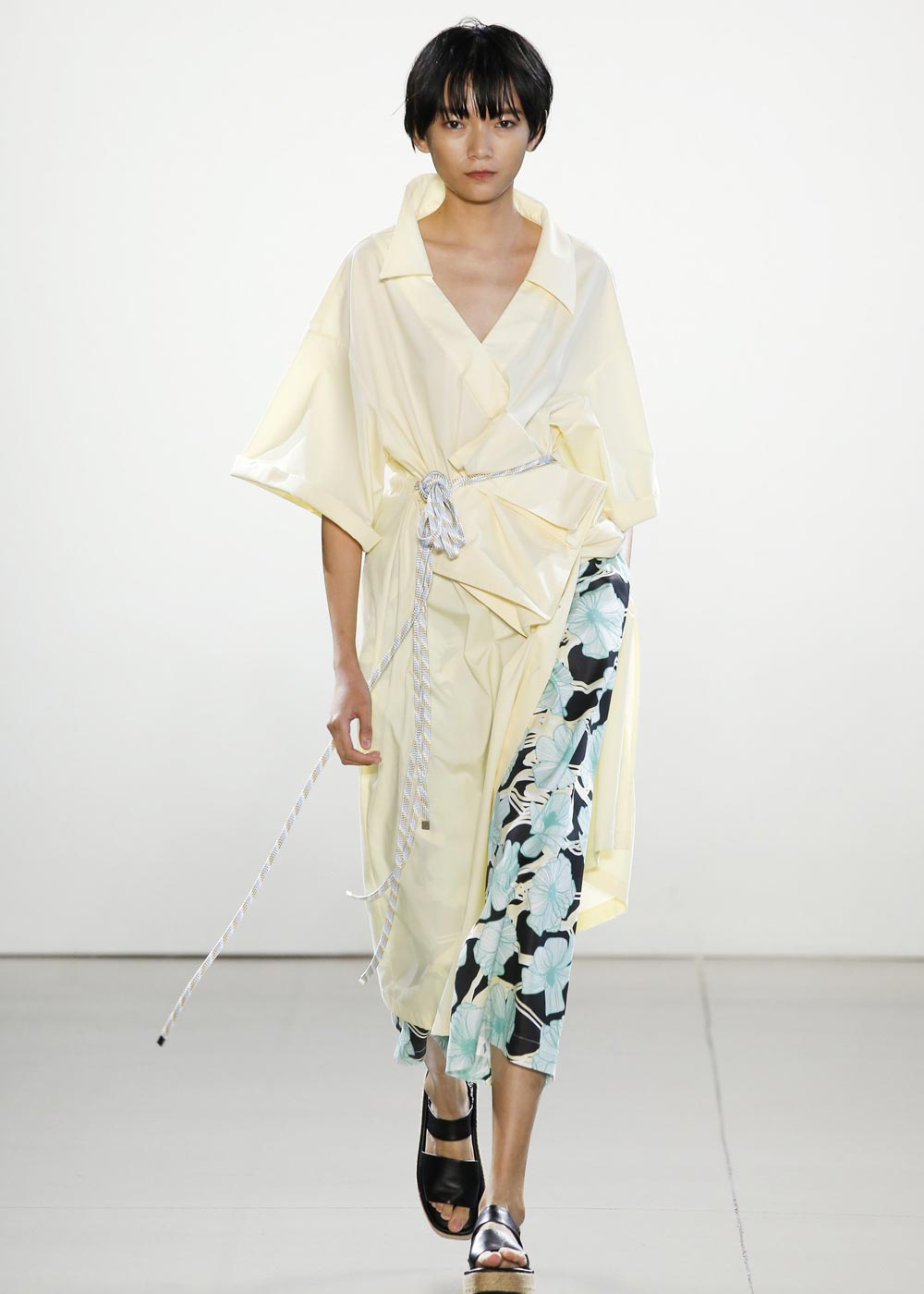
CLAUDIA LI IS A NEW YORK-BASED FASHION BRAND CELEBRATED FOR ITS BOLD, SCULPTURAL SILHOUETTES AND UNAPOLOGETIC INDIVIDUALITY. DRAWING FROM THE FOUNDER’S MULTICULTURAL BACKGROUND AND FINE ARTS TRAINING, THE BRAND BLENDS INNOVATIVE CONSTRUCTION WITH RICH TEXTURES AND PLAYFUL PRINTS TO CREATE PIECES THAT ARE BOTH EXPRESSIVE AND EMPOWERING.
THE PROJECT
BRANDED ECOMMERCE LAUNCH
PARTS & LABOR
01 DISCOVERY & STRATEGY
02 BRAND & UX DESIGN
03 CREATIVE DIRECTION & CONTENT
04 ECOMMERCE INTEGRATION
05 LAUNCH & OPTIMIZATION

THE PROJECT BEGAN WITH AN IMMERSIVE DISCOVERY PHASE—DIVING DEEP INTO THE BRAND’S ETHOS, AUDIENCE BEHAVIORS, AND MARKET LANDSCAPE. THROUGH COLLABORATIVE WORKSHOPS AND RESEARCH, A DEFINED DIGITAL STRATEGY WAS CREATED TO ALIGN WITH THE BRAND’S AESTHETIC AND BUSINESS GOALS.
DISCOVERY & STRATEGY

PARTS & LABOR
RESEARCH & INSIGHTS
STAKEHOLDER ALIGNMENT
COMPETITIVE AUDIT
CREATIVE STRATEGY
ECOMMERCE STRATEGY

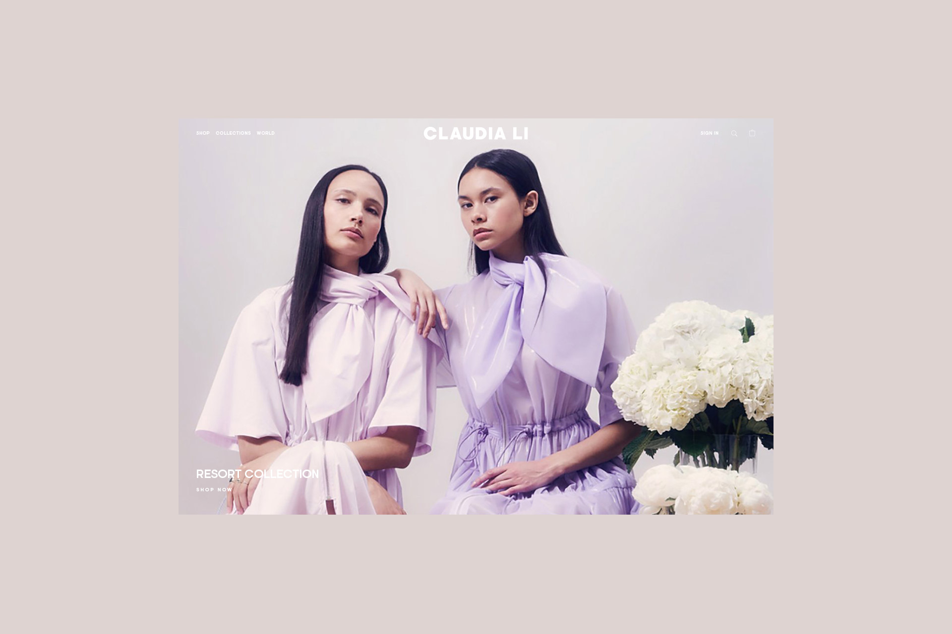
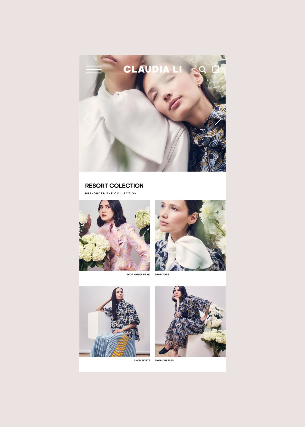
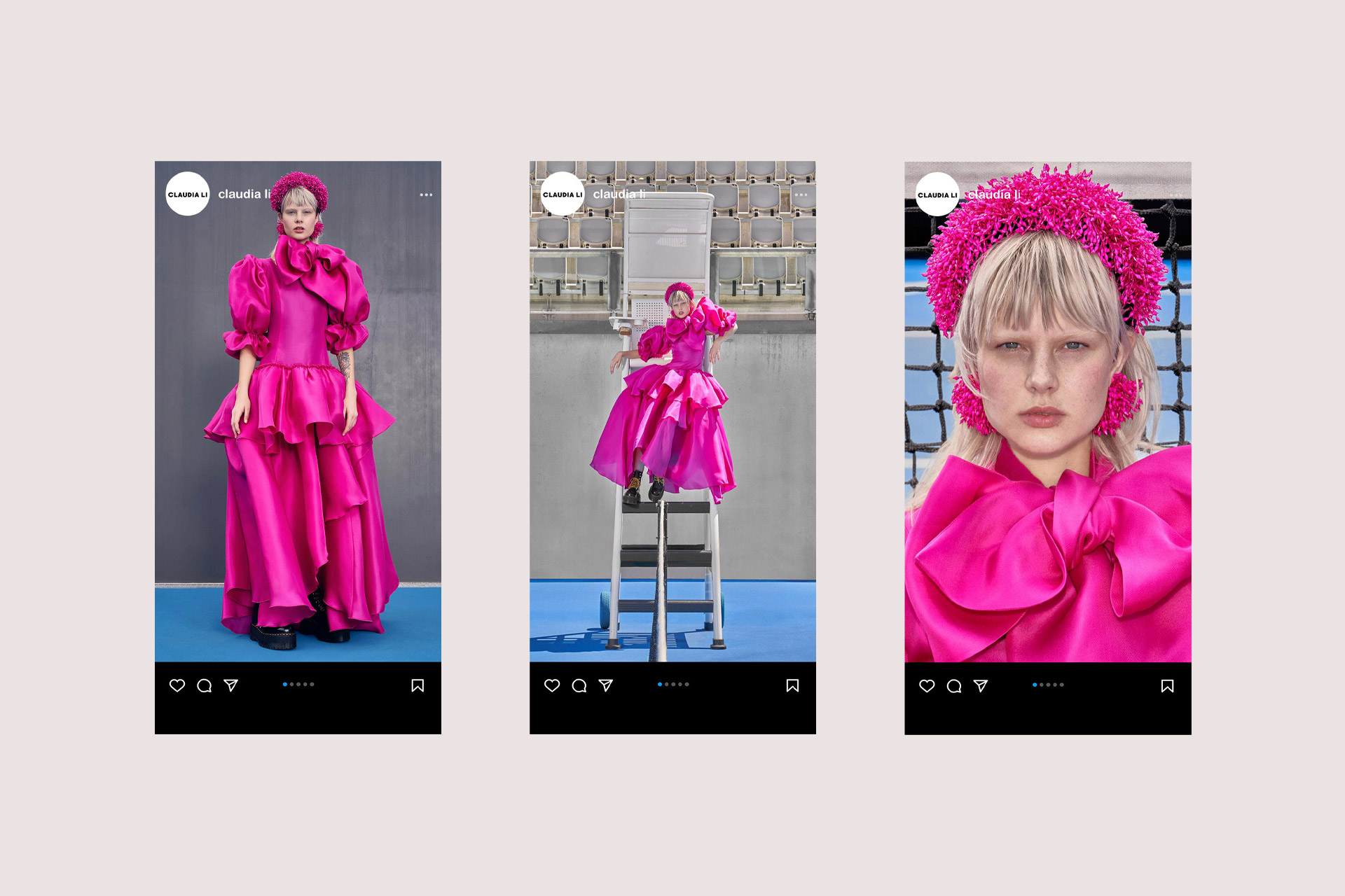
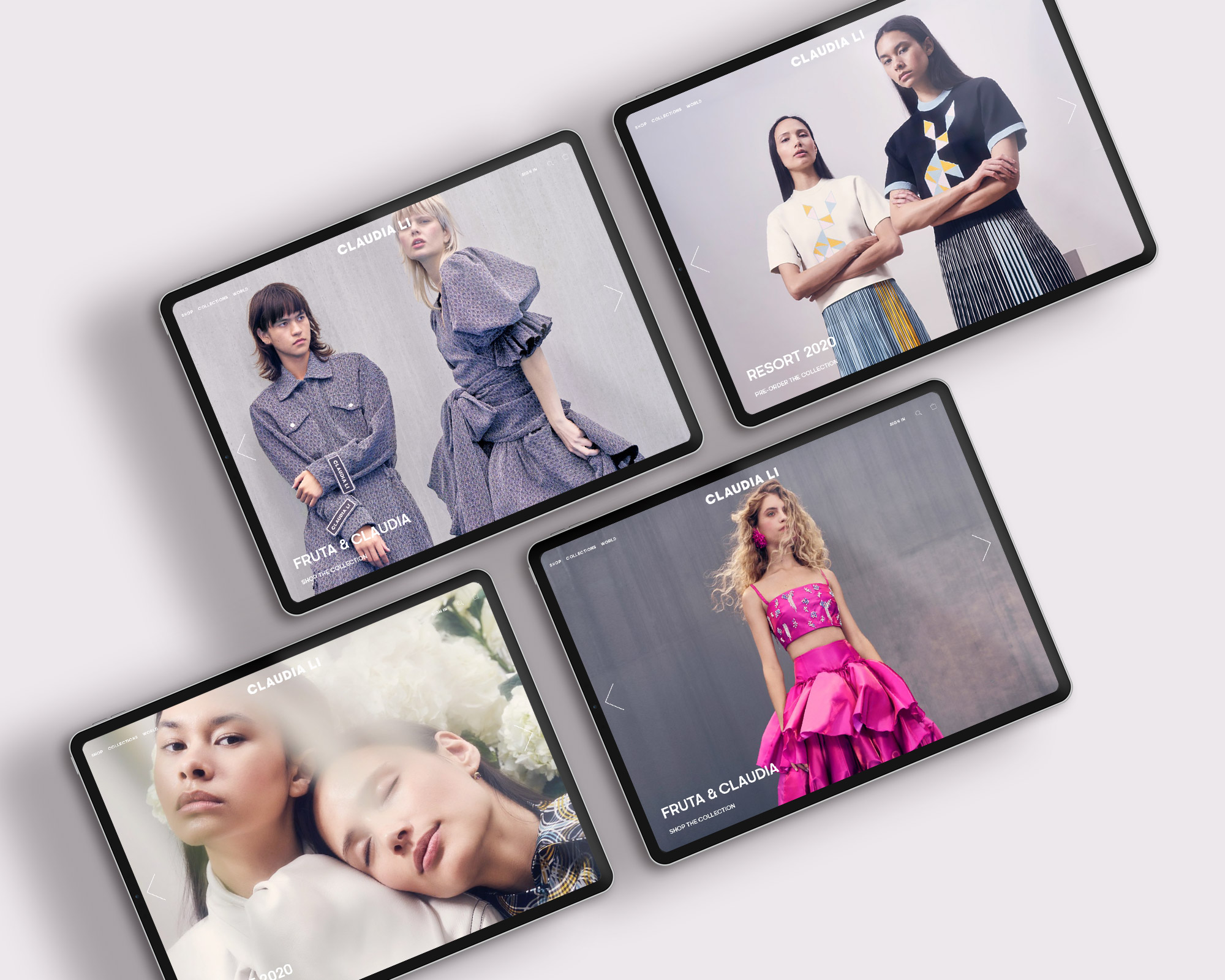
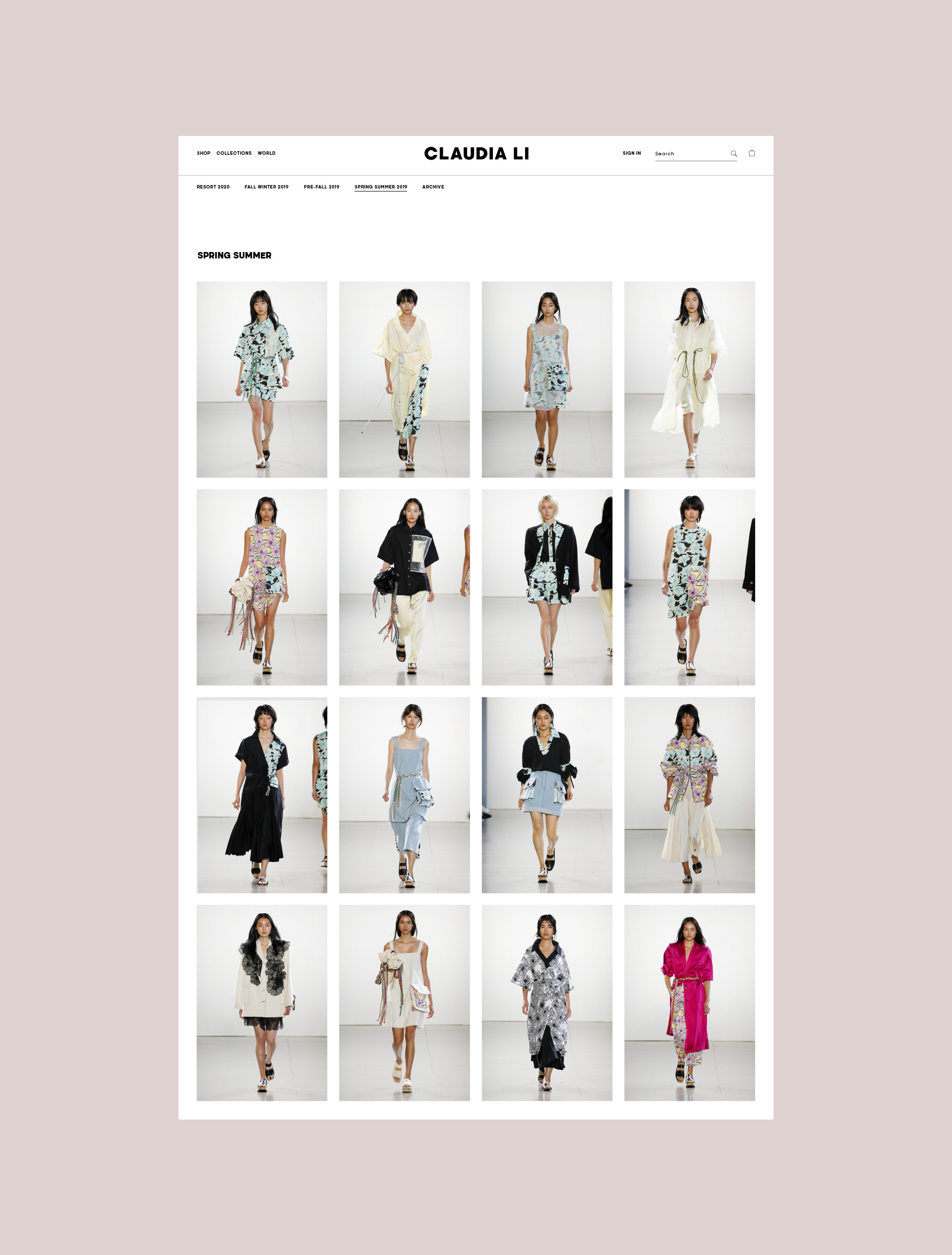
TRANSLATING FASHION INTO DIGITAL FORM MEANT CAPTURING EMOTION IN EVERY PIXEL. A CUSTOM-CRAFTED VISUAL IDENTITY SYSTEM AND USER EXPERIENCE WAS CREATED THAT WAS BOTH ELEGANT AND INTUITIVE—HIGHLIGHTING THE PRODUCT WHILE MAKING THE SHOPPING JOURNEY SEAMLESS AND IMMERSIVE.
BRAND & UX DESIGN

PARTS & LABOR
USER JOURNEYS
CREATIVE VISION
DIGITAL DESIGN / UI + UX
DESIGN SYSTEM

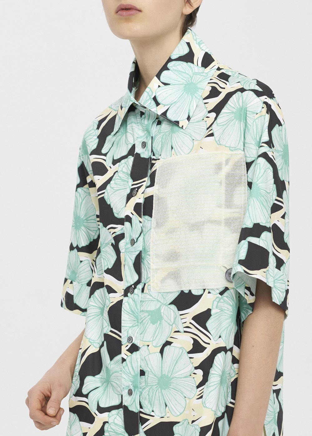
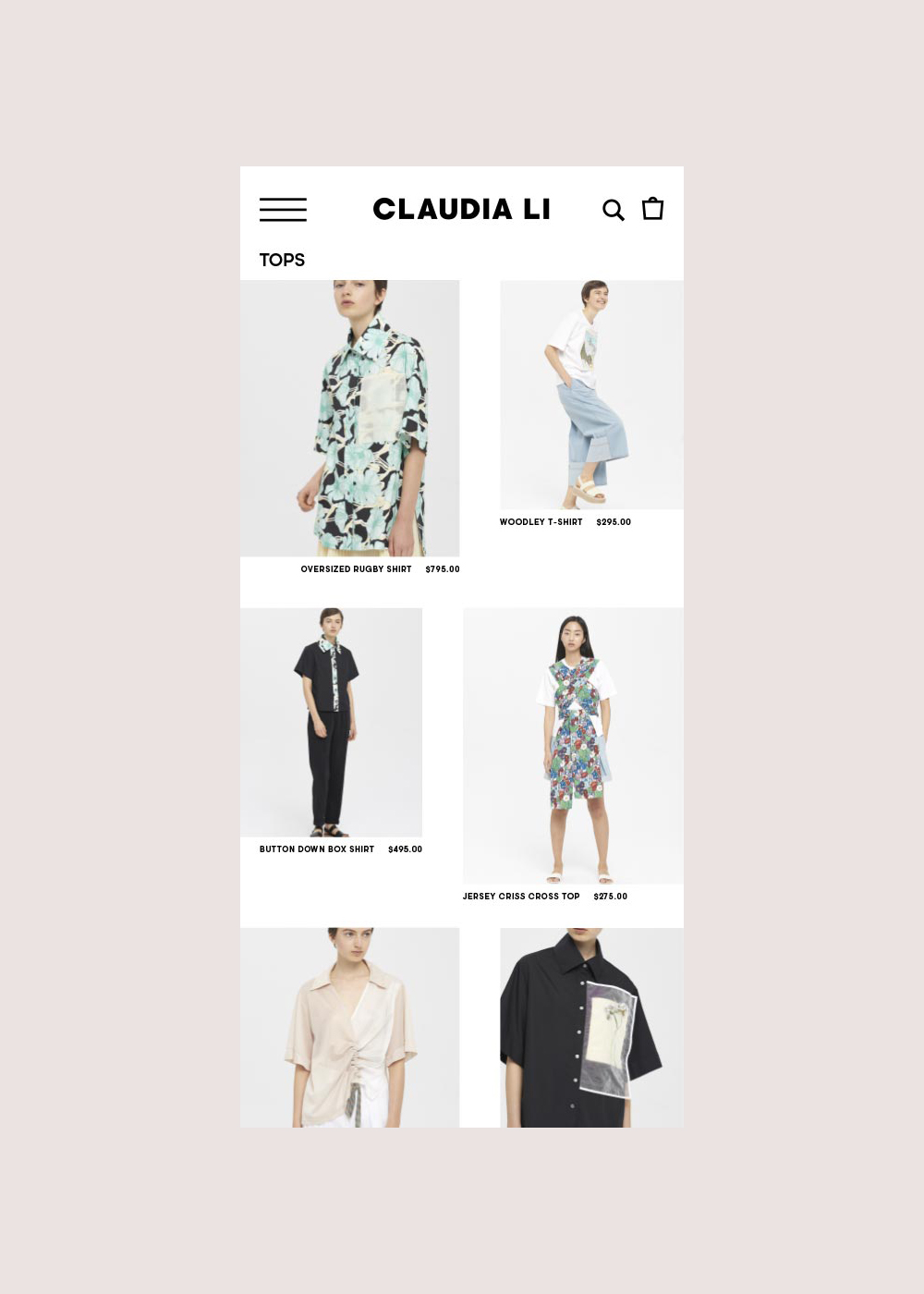
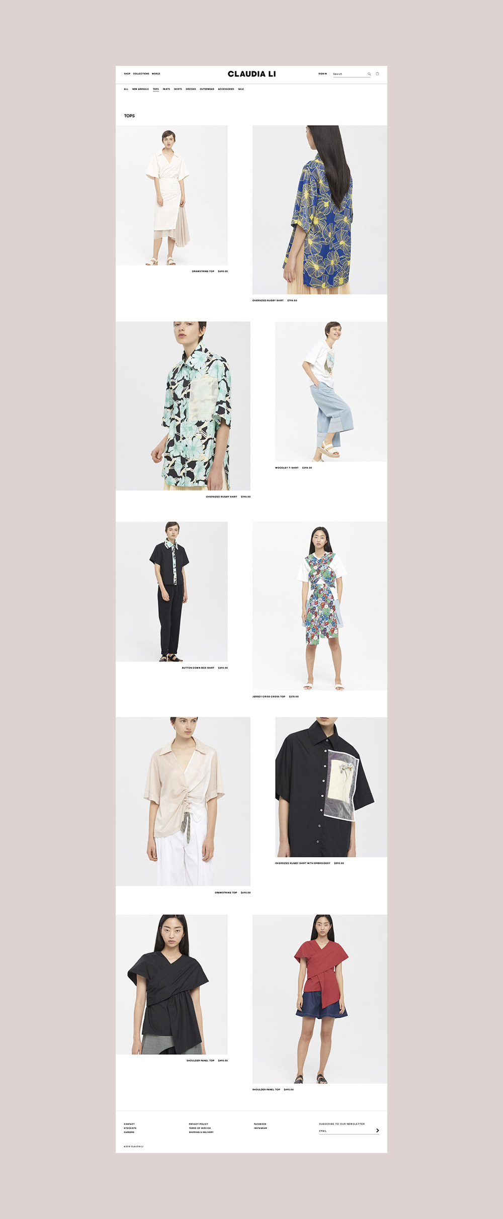

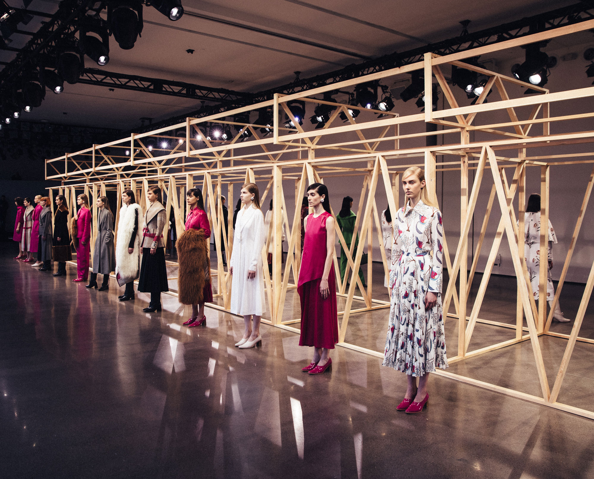
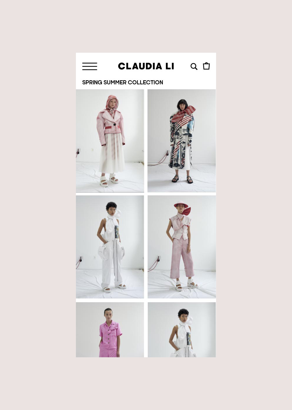
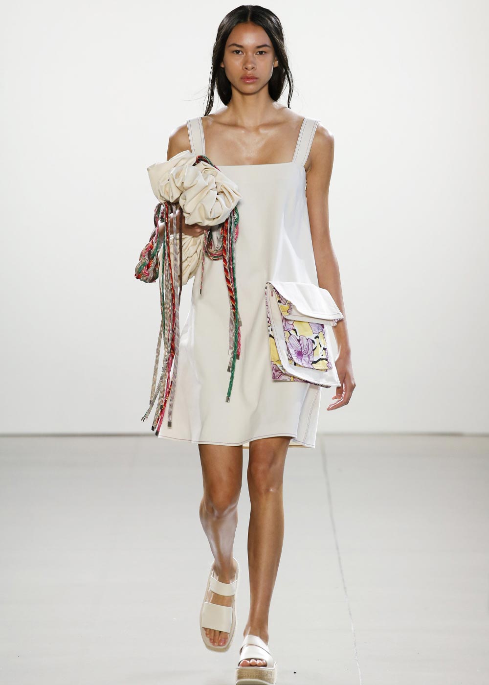
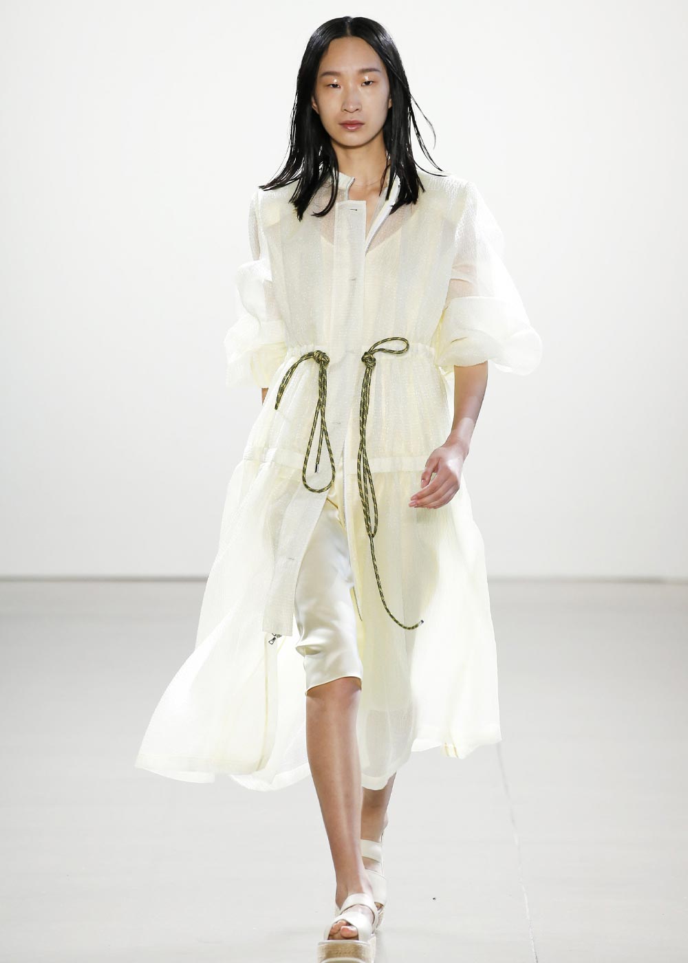
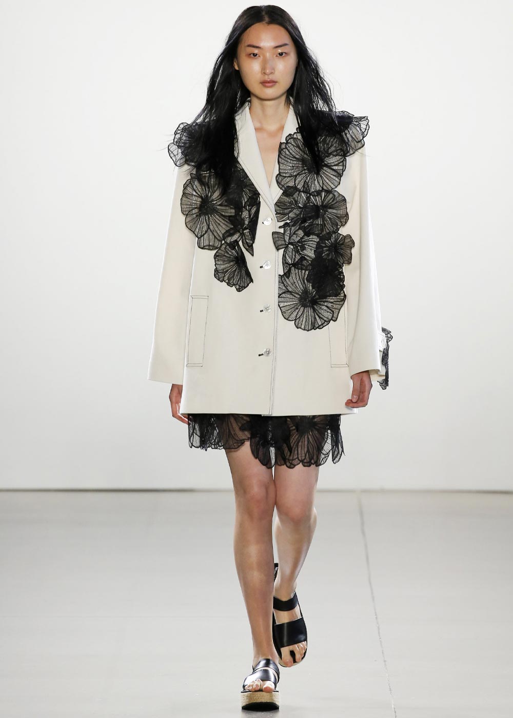
FROM LOOKBOOKS AND COLLECTION GALLERIES TO PRODUCT PHOTOGRAPHY, WE WORKED CLOSELY WITH THE BRAND’S CREATIVE TEAM TO DEVELOP AN ART DIRECTION THAT FELT EDITORIAL YET SHOPPABLE. EVERY VISUAL ASPECT WAS DESIGNED TO EXPRESS THE BRAND’S UNIQUE VOICE AND STYLE.
CREATIVE DIRECTION & CONTENT

PARTS & LABOR
WEBSITE DESIGN
DIGITAL BRAND GUIDELINES
CONTENT STRATEGY

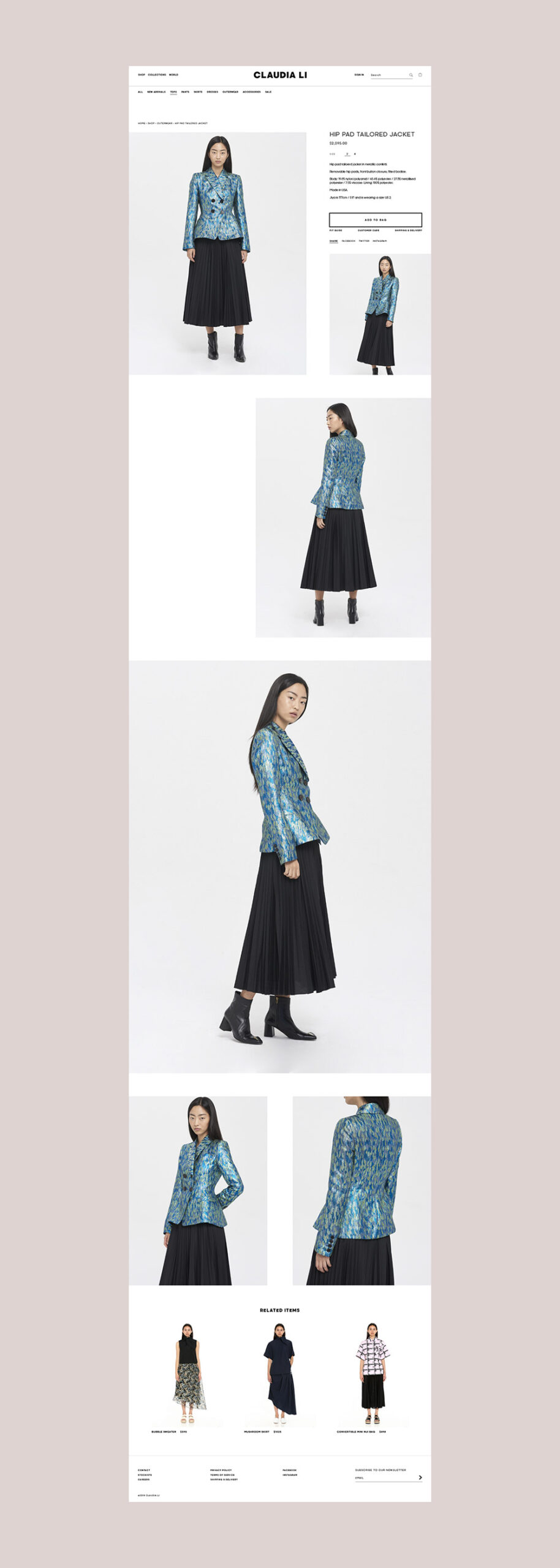
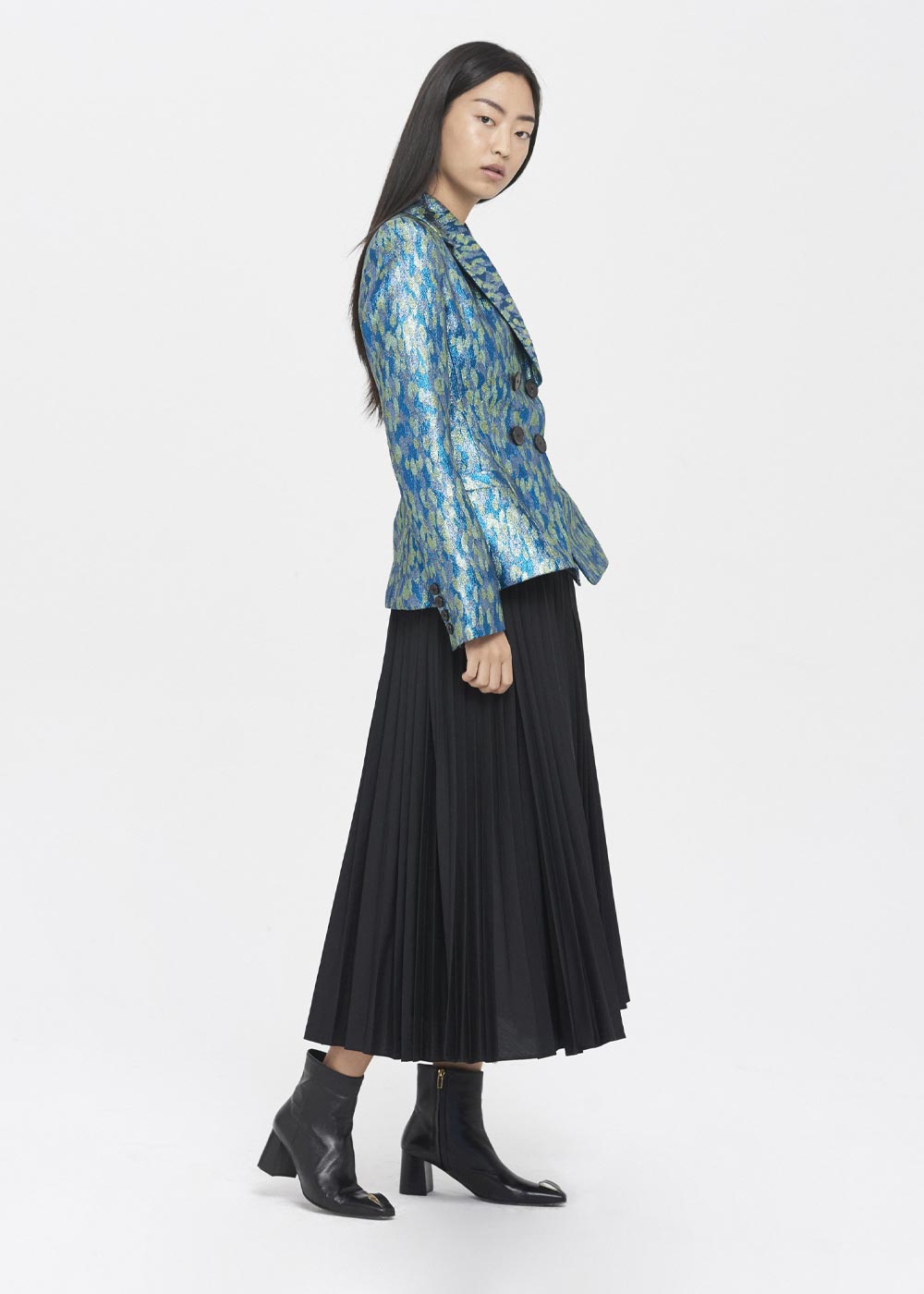
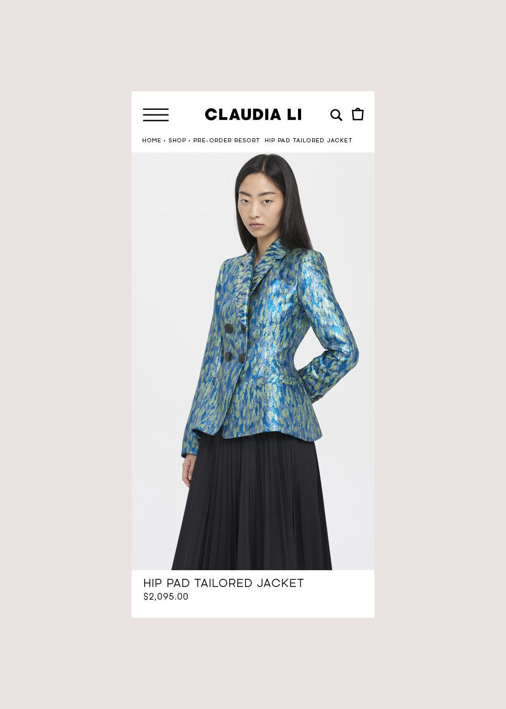
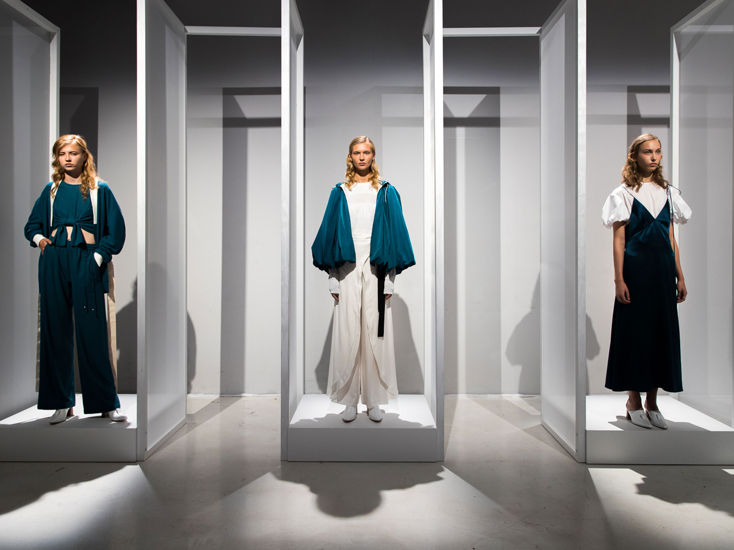
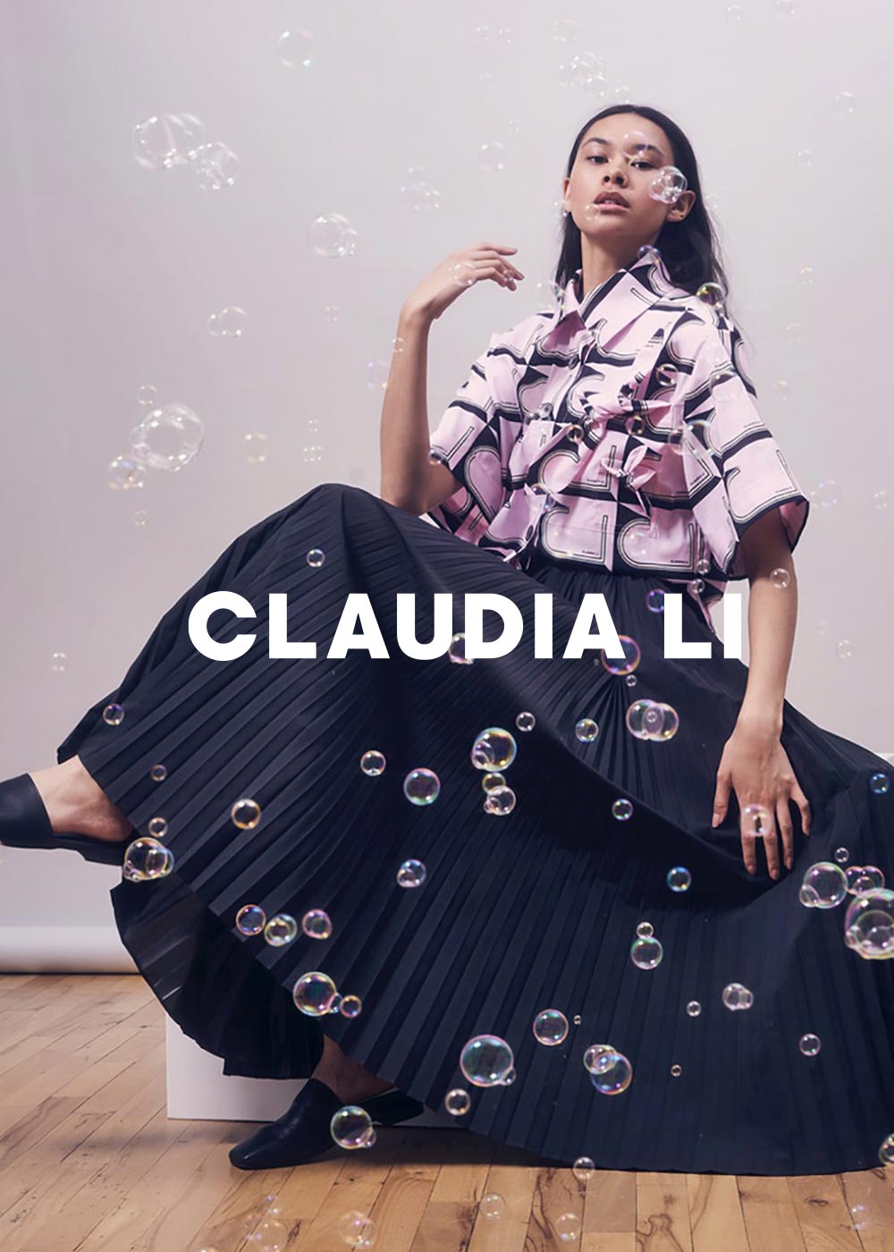
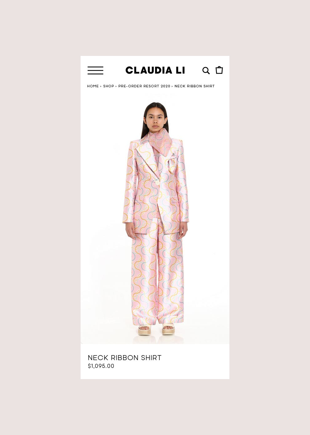
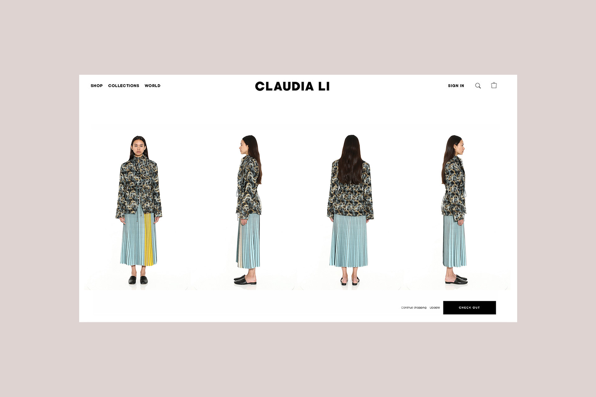
THE EXPERIENCE WAS BROUGHT TO LIFE WITH A FULLY RESPONSIVE BUILD ON SHOPIFY. PERFORMANCE, SCALABILITY, AND MOBILE-FIRST FUNCTIONALITY WERE KEY—ENSURING THE SITE DELIVERED AS BEAUTIFULLY AS IT LOOKED. FROM SMOOTH ANIMATIONS TO CONCIERGE-STYLE CHECKOUT FLOWS, PERFORMANCE AND POLISH WERE AT THE HEART OF EVERY DETAIL.
ECOMMERCE INTEGRATION

PARTS & LABOR
TECHNICAL CONSULTING
CMS ARCHITECTURE
DESIGN-TO-DEV PRODUCTION
SHOPIFY BUILDOUT

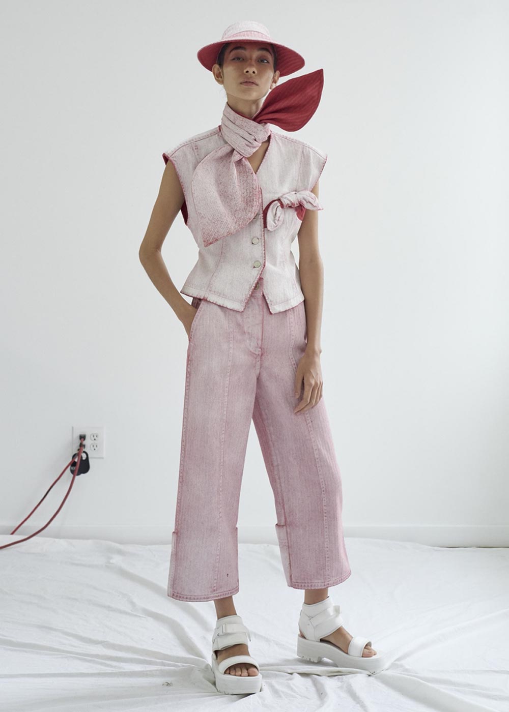
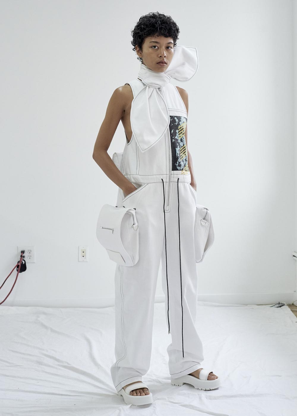
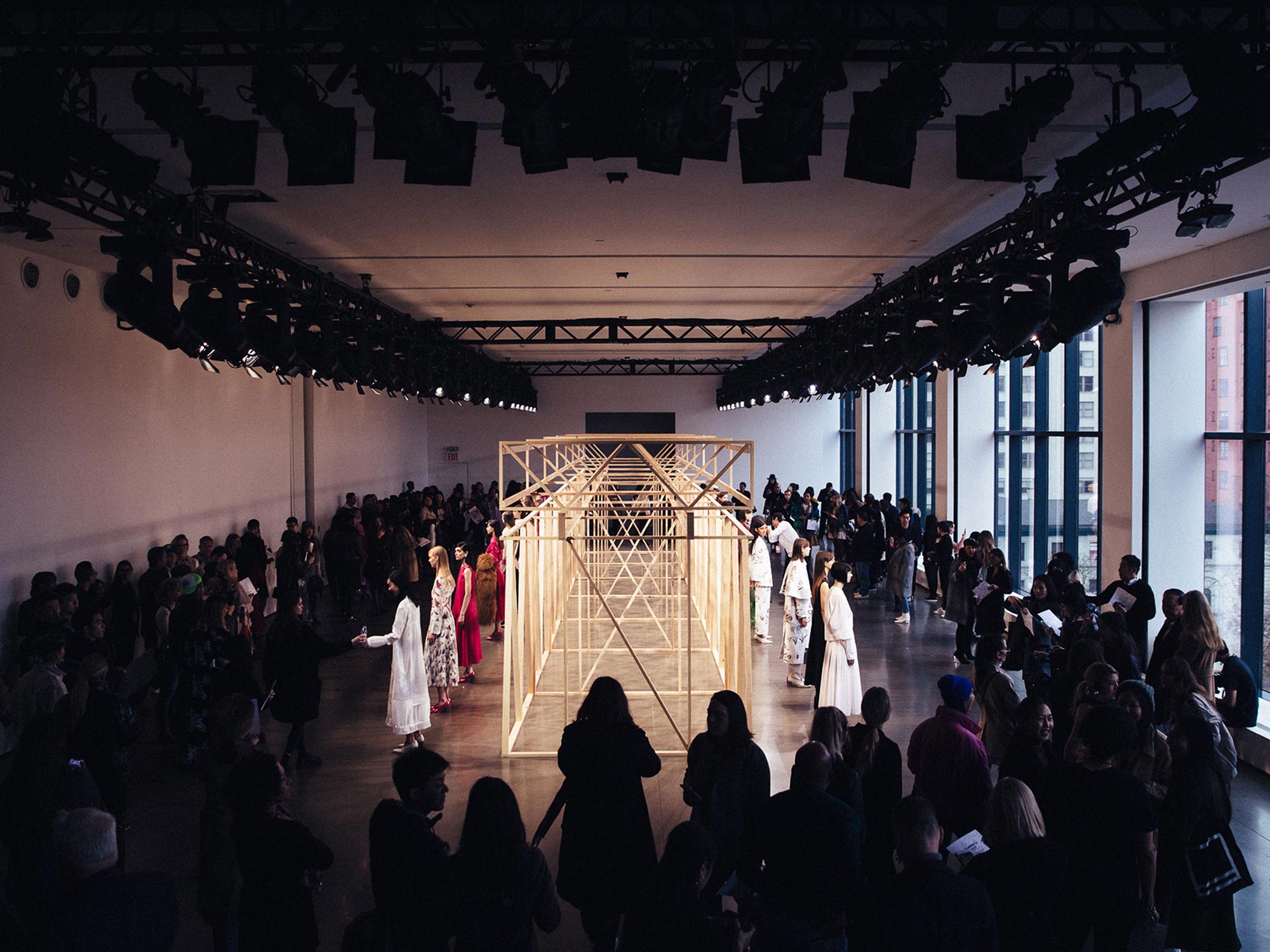
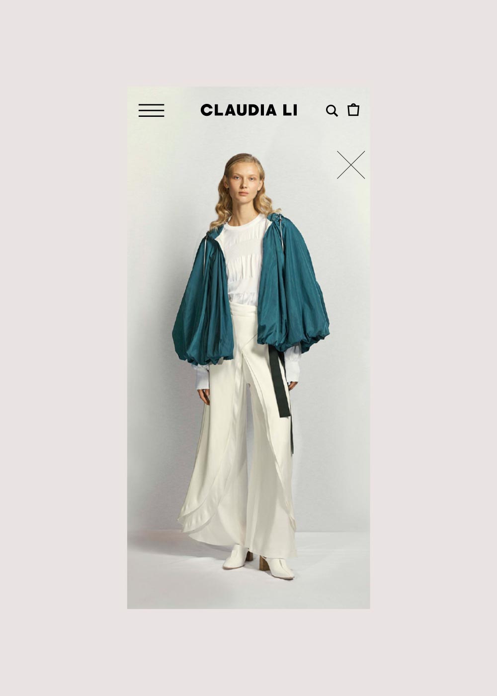
WITH A STRATEGIC LAUNCH PLAN, THE SITE ROLLED OUT WITH IMPACT. POST-LAUNCH, WE CONTINUE TO SUPPORT WITH PERFORMANCE OPTIMIZATION, DATA-DRIVEN ENHANCEMENTS, AND EVOLVING THE EXPERIENCE AS THE BRAND GROWS.
LAUNCH & OPTIMIZATION

PARTS & LABOR
LAUNCH STRATEGY
PERFORMANCE OPTIMIZATION
SEO OPTIMIZATION
ONGOING SUPPORT AND MAINTENANCE
NEXT PROJECT
DECORO
YES, KEEP SCROLLING


